Portfolio allocation app

Marcas

Active member
I like making apps :)
I also like apps well done.

Doing some research for my next coding project I stepped on this one.
I think it may be helpful.
Rather not for trading but makes general understanding of 'things' easier.
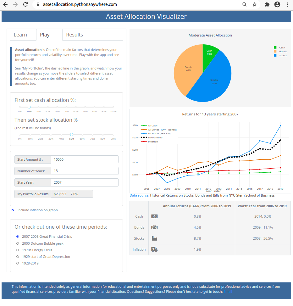
 
I think the books in the store are more interesting for those who are coders or are learning about coding

The app doesn't seem to be very useful It's just set for 2007
If I set it to 100% bonds and no stock it looks like my portfolio will have the same gain as the s&p 500 over 15 years Something doesn't look right
 
Link was not about books.

Interesting how we differently react to what the world offers.

I'm not 'asset manager' and don't think much about asset allocations but (or maybe because of that) I found the app informative.
It does not provide any data that can not be found elsewhere and does not offer much details if you decide to dig into the subject, nevertheless being able to interact with inputs and observe results on the graph is interesting and informative. To me that is.

I did not play much with it but what I see feels all right.
I suspect you didn't set it correctly. Calculated graphs for portfolio with 100% bonds match exactly bond performance - as it should.

I don't try to pimp, I have no interest in this app at all, but find it interesting. Many people here deal with this stuff daily - that's why I shared.

Can you tell more about why do you have the impression it 'doesn't look right' (maybe post a pic?).
 
I suspect you didn't set it correctly.
That could be
I did not look at it too carefully
I thought the first line was for stocks and the second line for bonds but actually the second line is for stocks and the assumption is that the rest is bonds
After playing with it some more to get the best performance out of it you would have to be 100% in bonds up to 2013 and than switch over to 100% stock although I don't see any dip in stocks in 2020
 
I played with it a little too. I think it is a good app exactly because it does not provide much options to play with - which forces you to look at bigger picture. One can focus on portfolio allocation aspects but also other 'thinking points' are accessible. For example look at official inflation line - if you quickly double click on red line in legend you can isolate that. When it started picking up and why is that. Can you draw some preliminary conclusions.
A thing worth mentioning is that green line, named "cash" in reality means treasury bils (short term bonds) - graph makes more sense if you realize that.
 
Top
Contact Us